Introduction
I work for Vertalo, a digital transfer agent — in short, we make the magic happen for the transfer of digital assets, such as tokenised securities, by maintaining and updating ownership records.
Of course, having a robust, powerful, and well-designed database is critical. We have to organise and manage information about clients, issuers, transactions, and so much more.
Traditional tools to facilitate working with databases include visualisations such as Entity-Relationship Diagrams (ERDs), but these suffer from two large caveats: first, they often require manual construction and updates, making them impractical for large and evolving databases. Second, as databases evolve and grow in size, the number of tables and their relationships increase, making it difficult to comprehend the overall structure of an ERD (and therefore update the database or get the data we need).
 Oracle Entity Relationship Diagram (ERD), truncated. Courtesy of IBM (https://www.ibm.com/docs/en/ibm-mq/9.1?topic=tables-oracle-entity-relationship-diagram)
Digesting the Situation: Looking at Graphs
So, how might we effectively visualise and comprehend the complex relationships within relational databases, in a manner that is automated, scalable, and intuitive for developers and data professionals?
We first identified the most urgent aspect of database relationships to present — foreign key references. An example of this would be logging purchases made at a department store. In each record, we’d like to not only see what was bought and for how much, but also see some identifying information (presumably, a unique code) about the customer who made the purchase. This reference will be a “foreign key” to another table, where we can find more information about that customer, such as their name, phone number, and address.
Our challenge was looking more and more like a graph problem. Tables were nodes, and foreign key references were directed links.
A Tale of Two Parts: Making an Action Plan
Now that we know we’re really working with a graph problem, we have two challenges.
-
How can I get all of the raw information I need? I need to know what tables are there and log all of the foreign key references going between them.
-
What type of visualisation or diagram will best present this data in a digestible and navigable format?
Part 1: Data Processing
Our database is implemented in PostgreSQL:
PostgreSQL is a powerful, open source object-relational database system with over 35 years of active development that has earned it a strong reputation for reliability, feature robustness, and performance. (https://www.postgresql.org/)
A lot of metadata is stored in low-level catalog tables, describing the database’s structure, objects, etc. Querying these can reveal much information about the database itself. In our case, we used a few of these handy-dandy tables:
pg_catalog.pg_class, which contains all of the tablespg_catalog.pg_namespace, which contains all of our schemas (or abstract groupings)pg_catalog.pg_constraint, which contains all constraints (or foreign keys)
Given a list of schemas s, then, we are able to get a list of all tables a_1, a_2, ... , a_n that belong to any schema included in s. For each table a_i, we also learn of its foreign key references.
At this point, we also made a decision: given a list of schemas s, if a table t belonging to a schema in s references a table g belonging to a schema not in s, we do not want to see the reference from t to g.
So, at the end of the day, we have exactly all of the foreign key references originating and ending in the schemas we included originally, no more, no less.
We also take advantage of the row_to_json() function, which helps us package our query results into JSON format, which will be useful for data processing and rendering.
An example entry from the final query output could be {"schema_name": "vertalo", "table_name": "table1", "referenced_schema: null, "referenced_table": null}, for a table with no foreign key references, or else something like {"schema_name": "otherschema", "table_name": "table1", "referenced_schema": "vertalo", "referenced_table": "table3"}, for each foreign key reference a table has.
We take two passes through the JSON array to compile a list of all of the tables, and for each table t, we catalog (no pun intended) the schema t belongs to, all of the other tables t references, and all of the tables that reference t.
Part 2: Visualisation
Given some (nicely packaged, if I do say so myself) information about tables and how they reference each other, how can we best display this information?
The easy part was deciding to use D3.js. The hard part was deciding what type of graph would be most effective.
We first started with an arc diagram. An arc diagram places nodes in a line, with arcs to connect them. We used semi-circular arcs to connect nodes placed on a vertical axis, with horizontal labels listing each table’s name and schema.
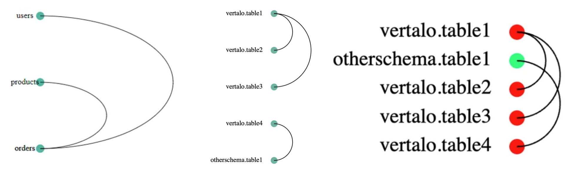 Arc diagram iteration, from left (proof of concept) to right (generated on test data)
Each node is color-coded by schema. We implemented four sorting mechanisms:
- by schema then table name
- by table name
- by descending number of outgoing foreign key references, and also
- by descending number of inbound foreign key references.
However, while useful for indicating the existence of a relationship between two tables, these arc diagrams don’t give us any sense of directionality. Which table is referencing which?
In addition, we would greatly benefit from having a clear visualization of paths between tables. This would be particularly valuable for writing JOIN operations, which combine data from multiple tables, and constructing queries in GraphQL, a language for APIs and databases. By understanding the relationships between tables, developers can efficiently navigate and optimise data retrieval, ensuring precise queries and streamlined API interactions.
From these two additional constraints, we pivoted to implementing a parallel plot diagram. We started by building simply a two-axis version:
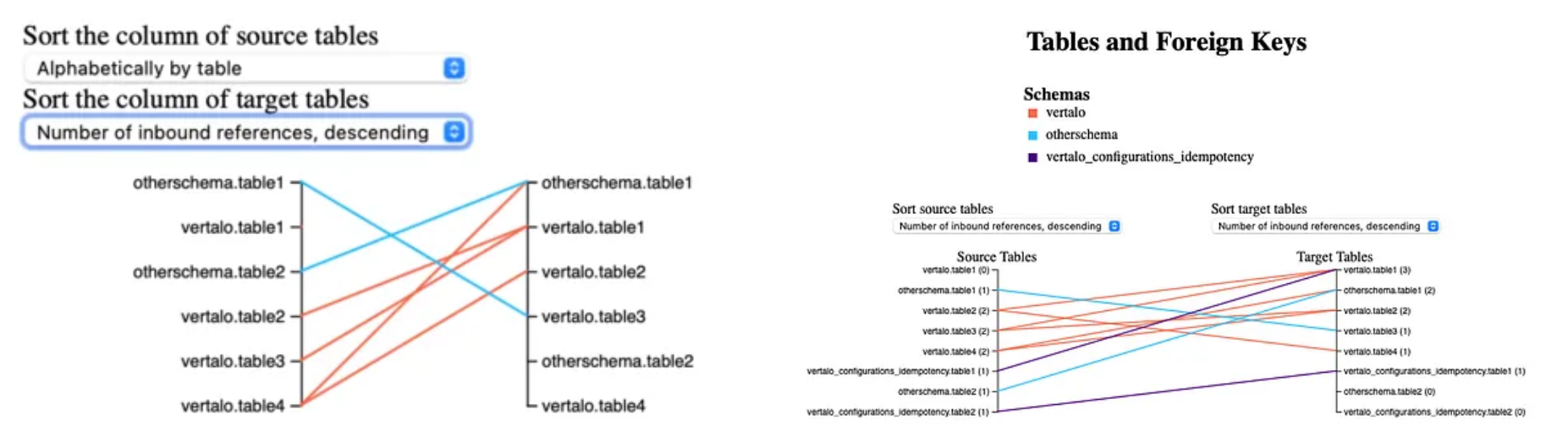 Initial parallel plot (left) and first version of deployed diagram (right)
This version allowed for separate sorting on each axis, using the same four mechanisms. And, in this version, a link going from table t to table g would be coloured according to the schema to which table t belongs. This colour mapping is displayed in a legend at the top. Table names are annotated, as well:
- On the source axis, table names are appended with the number of outbound foreign key references.
- On the target axis, table names are appended with the number of inbound foreign key references.
Now comes the hard part: extending this diagram to display more axes dynamically and to allow for path filtering.
Unfortunately, this required substantial restructuring of the rendering code. It took a lot of trial and error, not to mention countless hours poring over D3.js documentation:
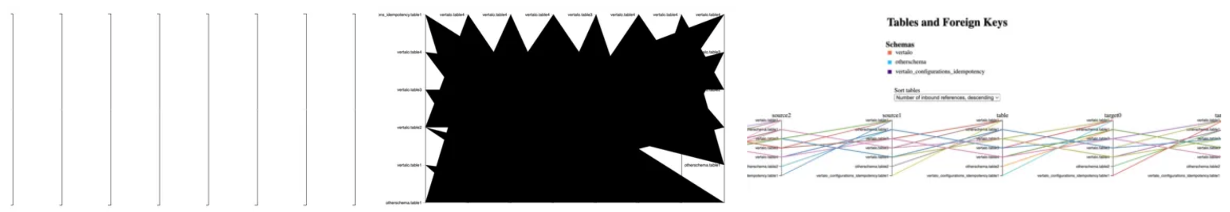 Progression of multi-axis diagram generation (chronological, left to right)
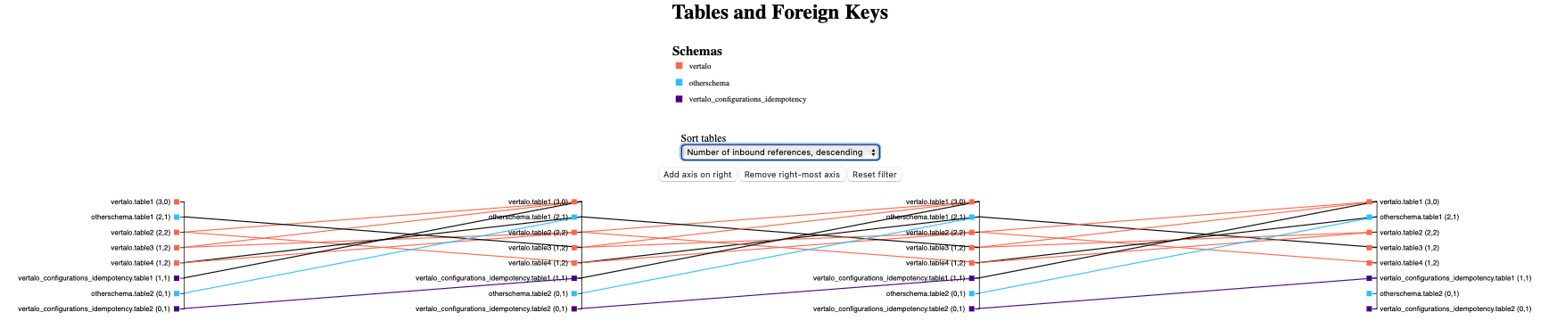 Final diagram with no filtering (generated from test data)
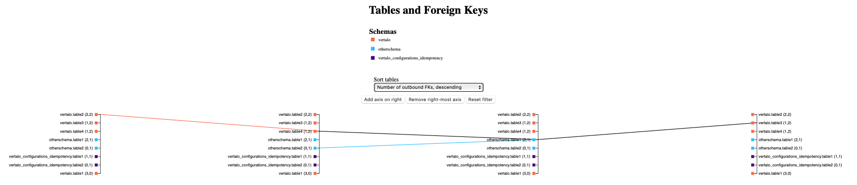 Final diagram with filtering on a table on the third axis (generated from test data)
Eventually, everything came together! Axes can be added and removed by clicking a button. The same four sorting mechanisms are implemented, although all axes sort together now. The diagram is auto-sized, and links are color-coded as well:
- If a link goes from table
tto tablegon the next axis, we check iftandgbelong to the same schema. - If
tandgbelong to the same schema, then we use the color mapped to that schema. - If
tandgbelong to different schemas, then we draw a black link.
Axis labels now include a lot of helpful information:
- the name of the schema
- the name of the table
- the number of inbound foreign key references (links from the left)
- the number of outbound foreign key references (links to the right)
- the colour mapped to the table’s schema
We can also filter paths by clicking on any axis label. By clicking on a given name on a given axis, we filter the graph to only display paths that pass through that table on that axis. This filter can be cleared using the reset button.
Value Added
The value added by using parallel plots to generate an iterative dependency graph for tables and their foreign keys lies in the clear visualization of paths between tables.
This visualisation not only assists in writing JOIN operations and constructing GraphQL queries, but also enables developers to understand the potential impacts and constraints of proposed changes on the database.
By comprehending complex relationships through parallel plots, developers gain insights into data retrieval optimization, precise querying, and can effectively assess the consequences of modifications to the database structure.
Future Work
There are other crucial aspects of databases that warrant attention, including function dependencies within databases. I am working on using the same structure to build an auto-generated call graph that will provide insights into how procedures, including functions, subroutines, and triggers, interact with and depend on each other within our PostgreSQL database.
Understanding these dependencies is crucial for comprehending the flow of data and control within a system, optimizing performance, and ensuring data integrity. By constructing an auto-generated call graph, we aim to provide developers and database administrators with a visual representation of these dependencies and hierarchies, enabling them to identify the connections, dependencies, and interactions among different functions, perhaps even potential bottlenecks or optimization opportunities as well.
To improve the effectiveness of these diagrams, it will be important to also update the design of these visualisations. A well-designed and visually appealing UI can significantly enhance the user experience and make the exploration and analysis of database structures more accessible and enjoyable for developers and data professionals. Most concerningly, the table names are currently overlaid on top of the links. This hinders readability and should be resolved quickly.
This holistic view of tables and procedures will empower us to make informed decisions, optimize query performance, and ensure the overall efficiency and reliability of the database system.